The garment as ex-voto
Architectural, communicative, and service redesign for transforming a second-hand shop into a community hub in Borgo Rovereto, Alessandria
2026 - ISIA FIRENZE THESIS PROJECT
Giulia Barone
Supervisor Giulia Reali
Co-supervisor Veronica Bogao
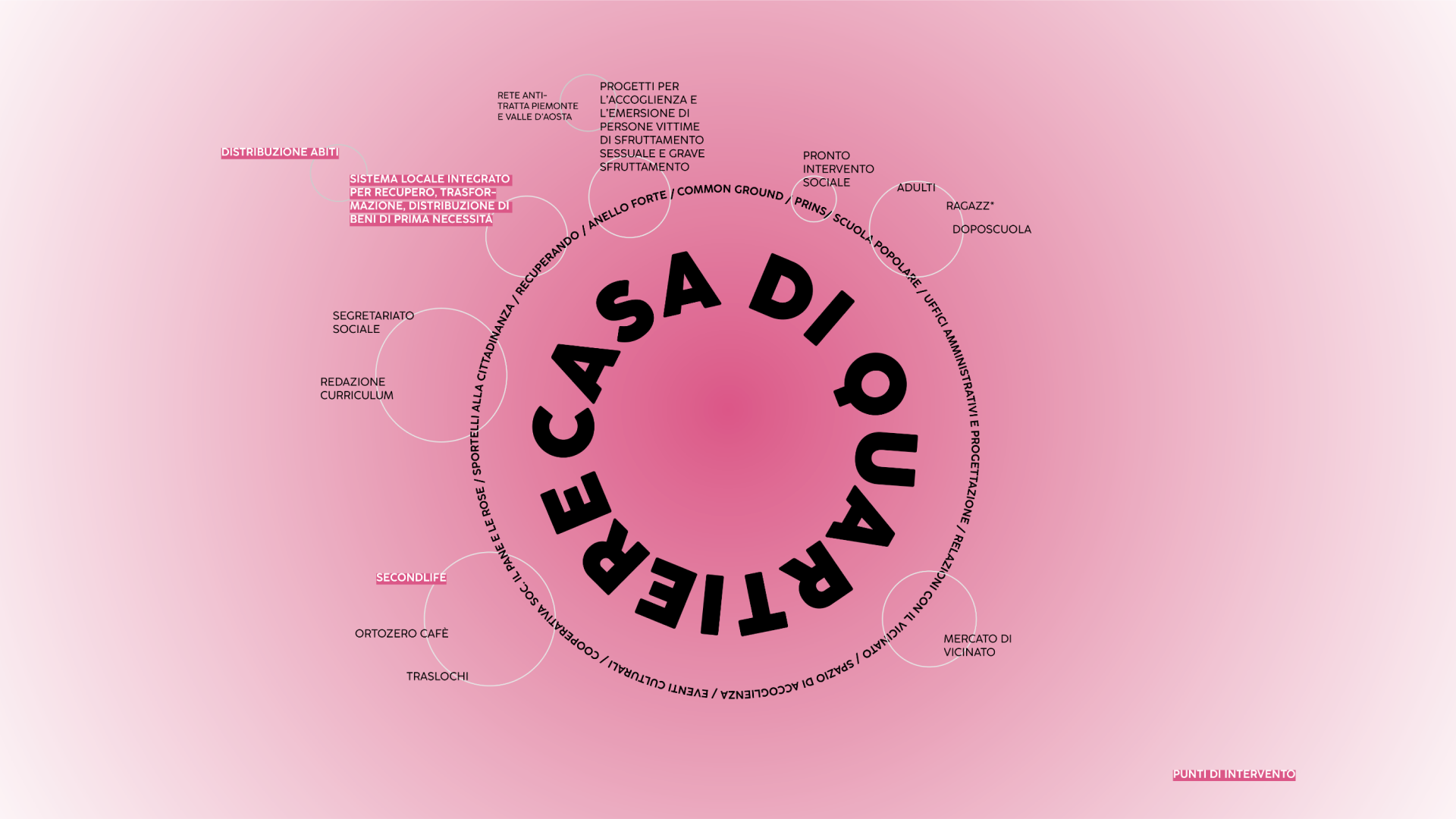
Per Vòt Fait is a master's thesis project exploring urban, social, and cultural regeneration through design. The core of the intervention focuses on Second Life, a second-hand clothing and object store managed by the Comunità di San Benedetto al Porto in the historic heart of the Borgo Rovereto district in Alessandria.
In an era dominated by the bulimia of linear consumption and fast fashion, the project transforms a local commercial space into a safe, free, and transfeminist community hub. It serves as a form of provincial resistance against consumerism, restoring anthropological and spiritual dignity to second-hand garments.
Research & Analysis
The Faith in Reuse and Context
An in-depth analysis of the socio-demographic context of Alessandria and the Borgo Rovereto district, supported by field research based on questionnaires (185 responses), dialogues with citizens, and the creation of the participatory podcast "Segui il filo", aimed at mapping the real needs of residents and vulnerable individuals.
Brand & Visual Identity / Social Media Communication
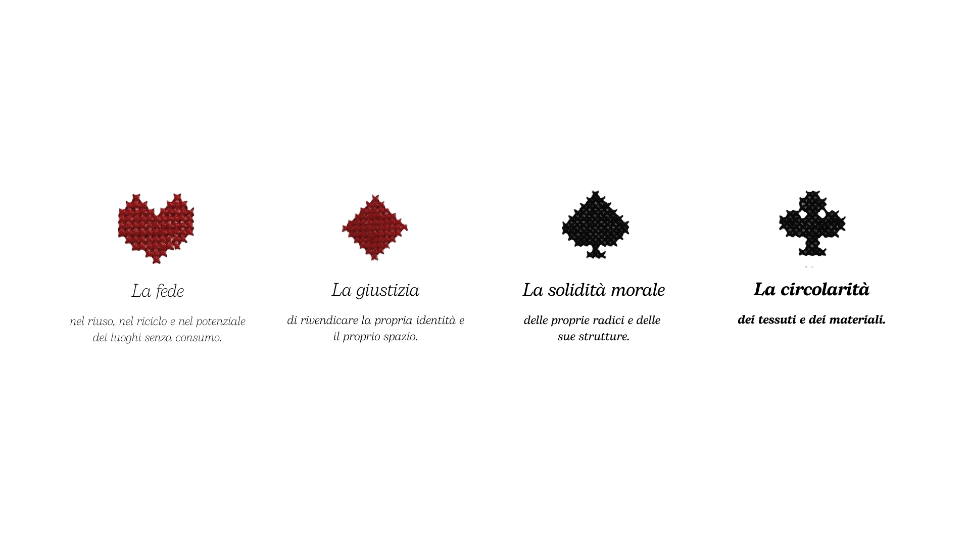
Justice
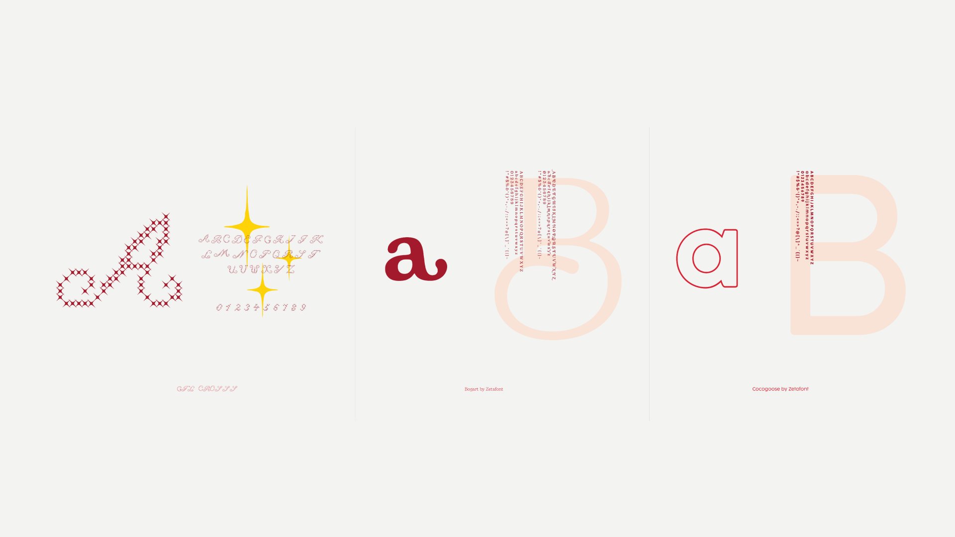
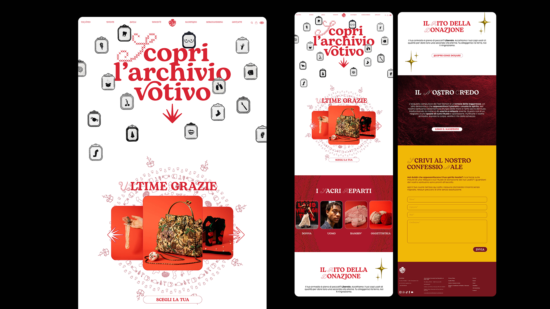
The visual identity and digital strategy of the brand deliberately subvert the usual minimalist and neutral aesthetics of eco-design to embrace a bold, pop, and visceral visual language. The typographic system is built on the dialectical contrast between the nostalgic softness of the Bogart serif typeface, which brings warmth and narrative depth, and the modular structure of the GTL Cross font, designed on the pattern of cross-stitch and the geometry of the Latin cross to recall the sacredness of the tailoring act. The Cocogoose font is used to complete the graphic apparatus for managing service texts.
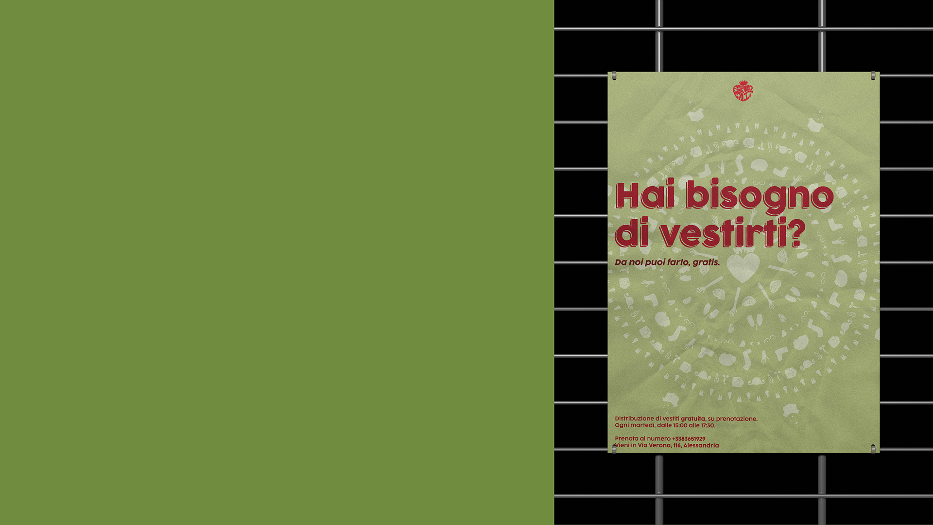
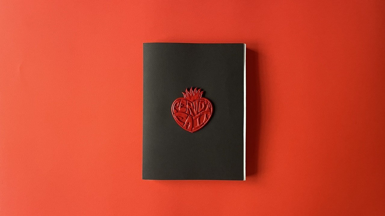
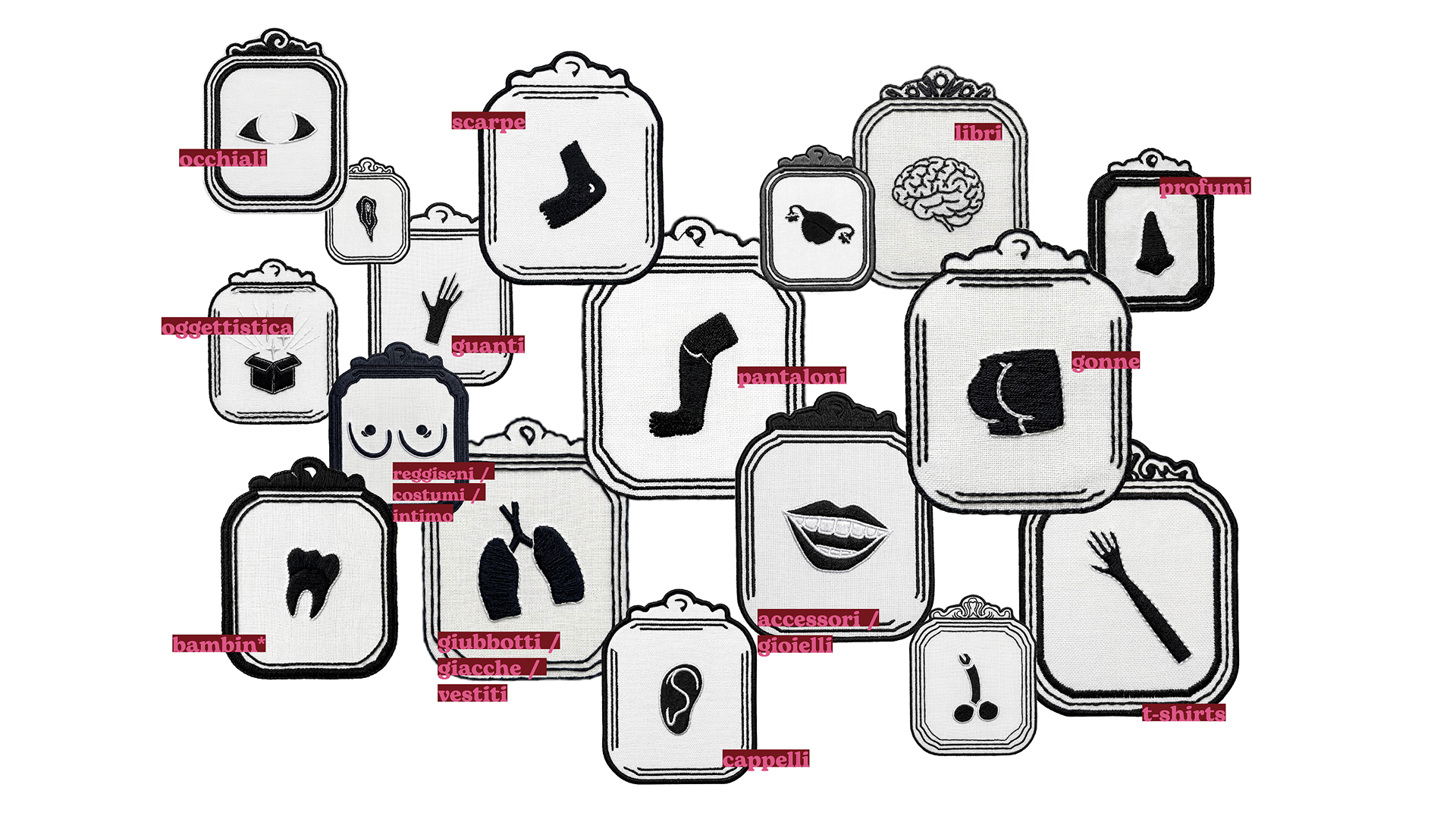
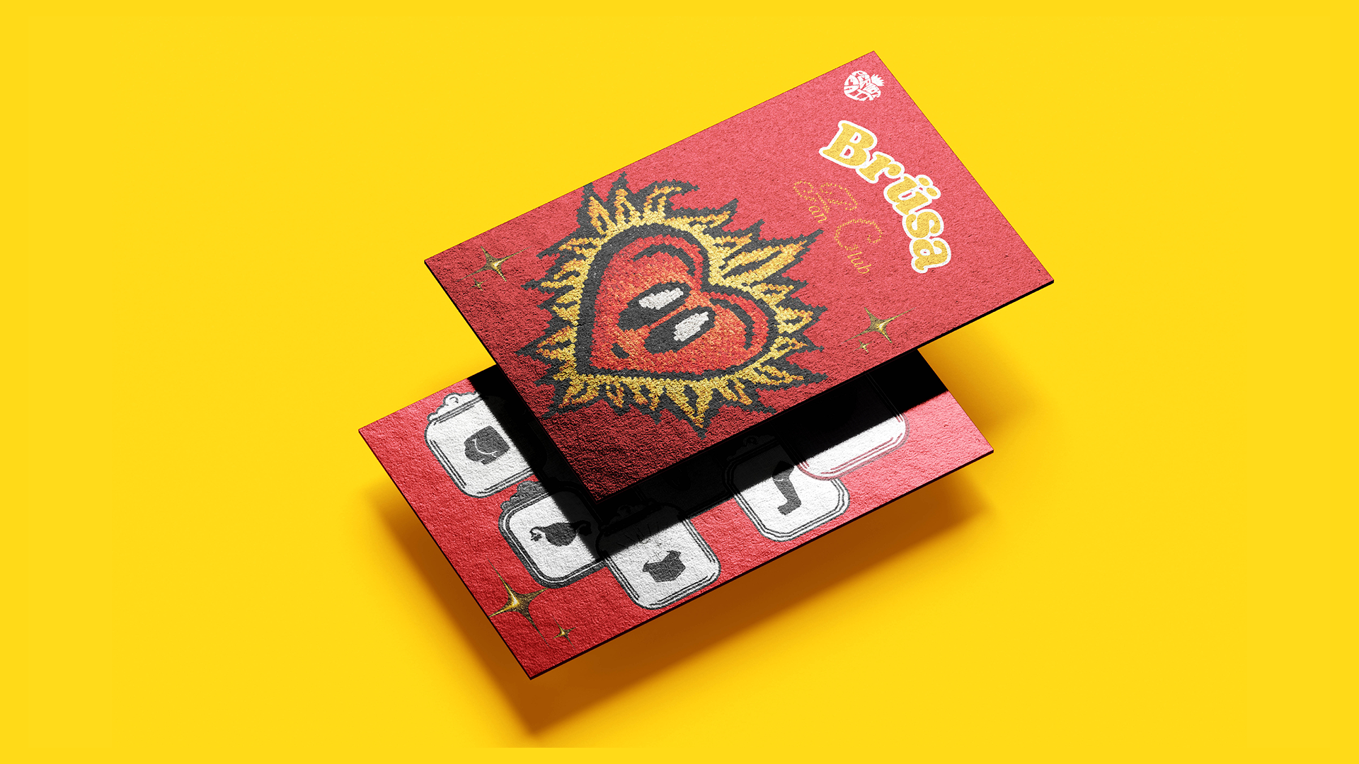
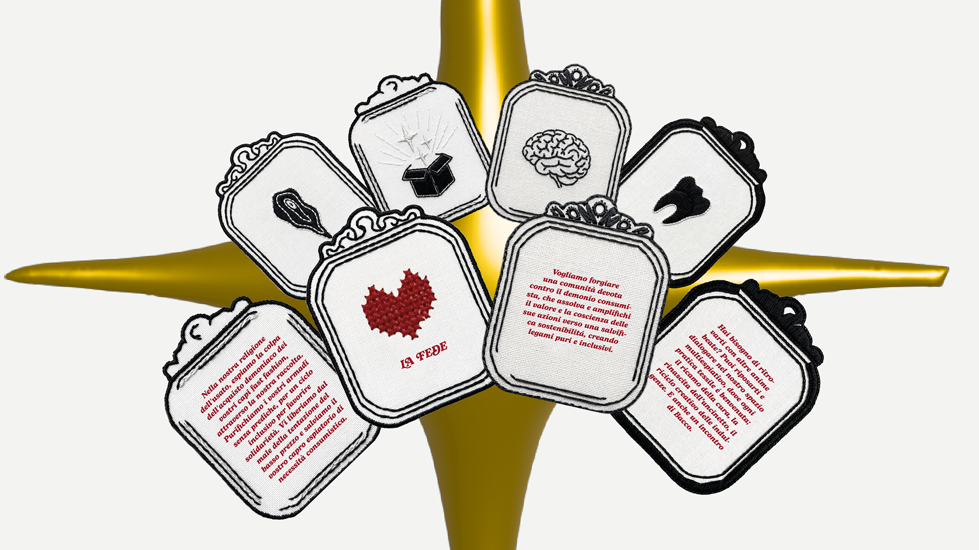
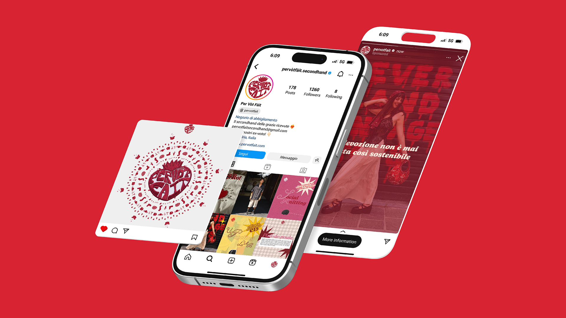
The color palette draws on the dense tones of deep red, magenta, and sky blue, paired with accents of yellow and olive green. From this framework comes a rich visual alphabet inspired by the anatomical symbolism of ex-votos, composed of hearts, hands, eyes, and lungs that not only organize the signage but take physical shape in embroidered patches, labels, and artisanal seals applied to the garments to enhance their uniqueness. The emblem of the logotype finally embodies Brüsa, an anthropomorphic flaming heart designed in the dynamic language of 1930s rubber-hose animation, which lightens the devotional component by introducing a tone of voice that is ironic, fresh, and accessible to a young audience.
This same visual and narrative identity propagates through the digital ecosystem and the content strategy for Instagram and TikTok

Spatial Redesign and Interior Design
Moral Solidity
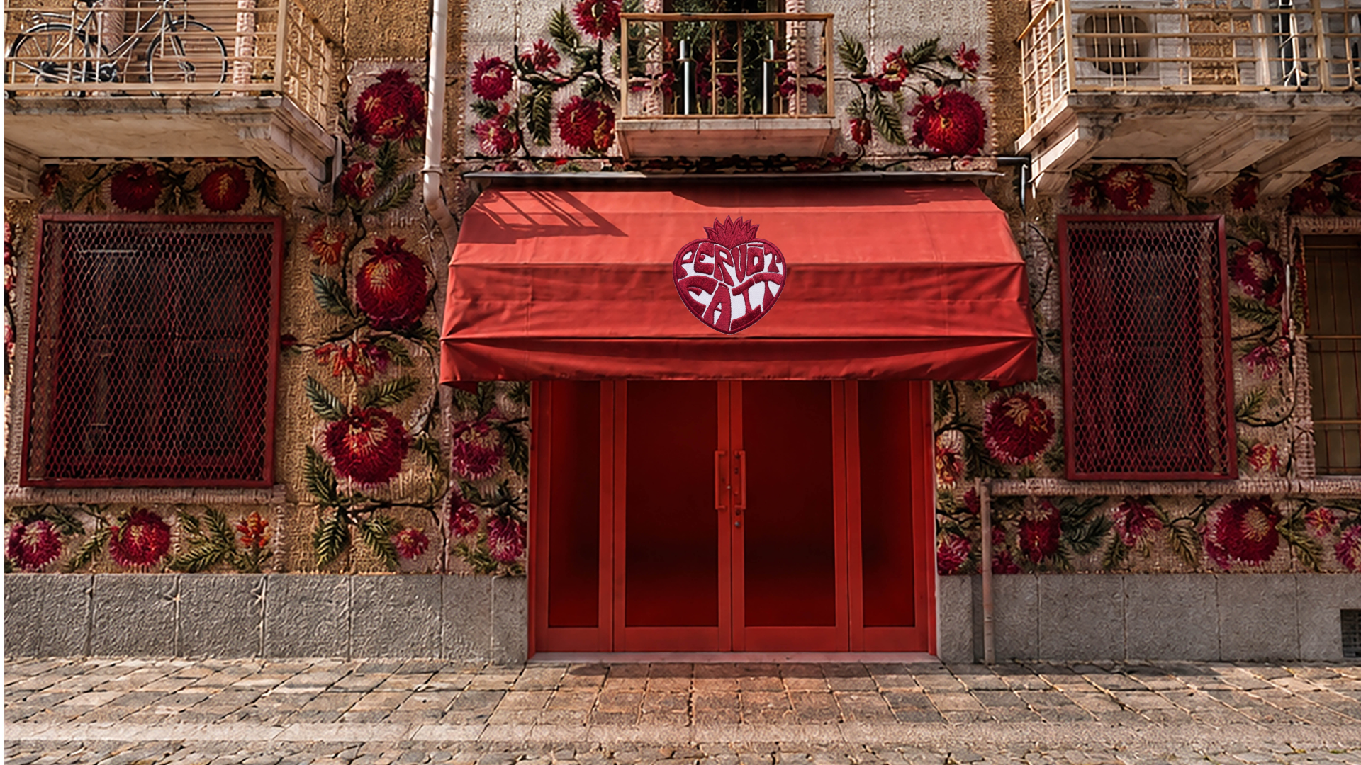
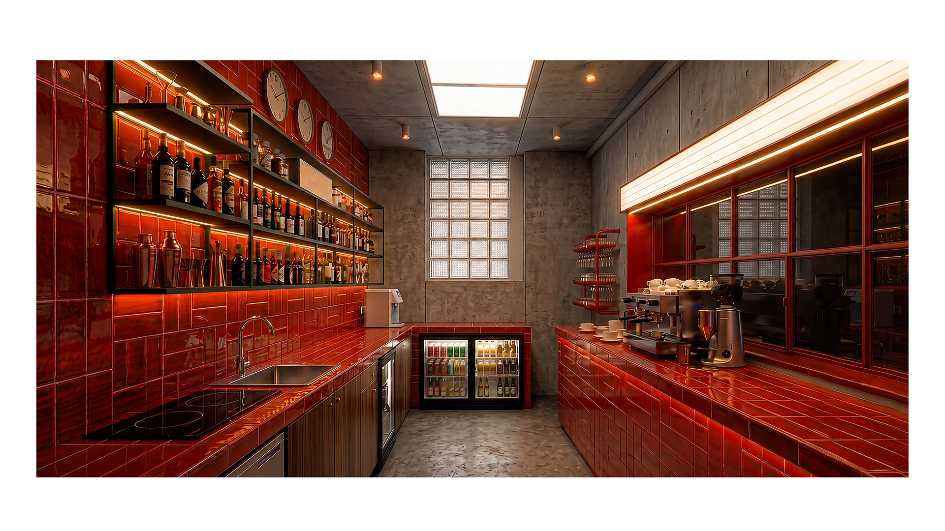
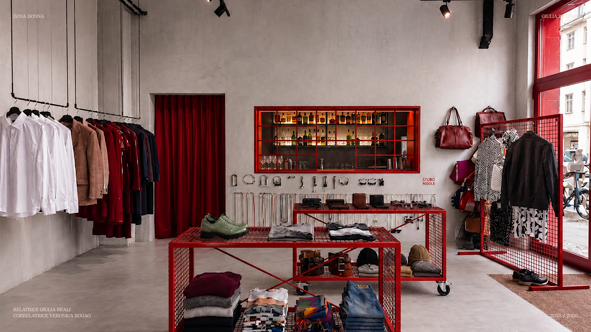
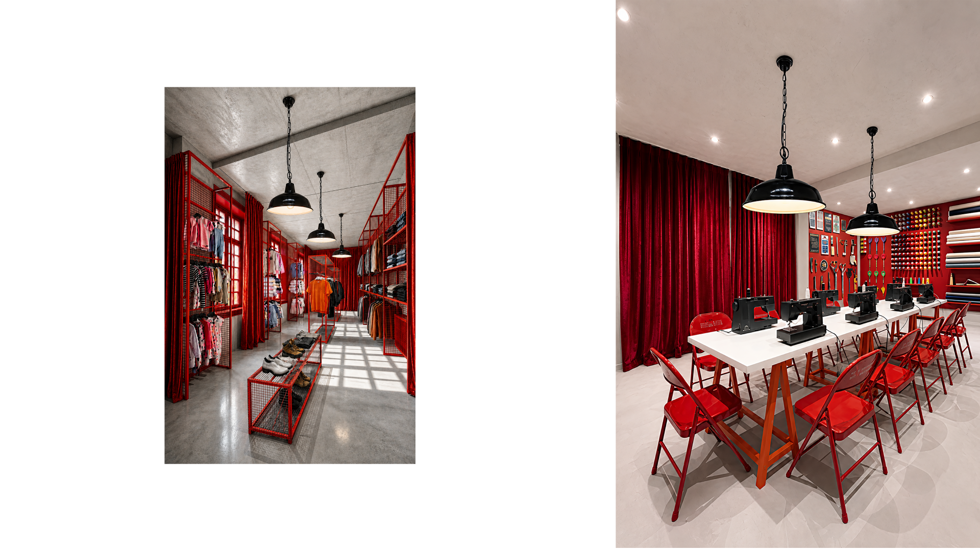
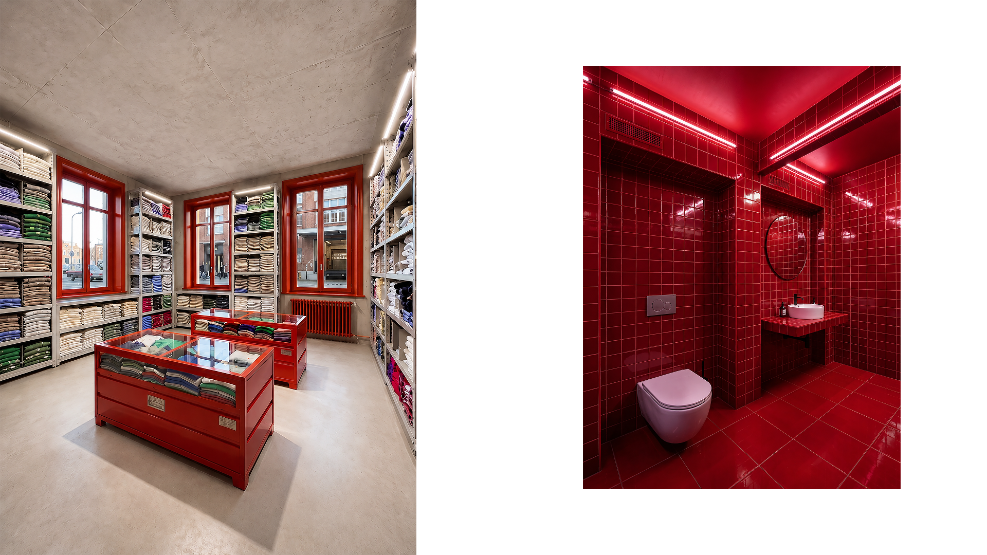
The interior configuration stems from an in-depth field survey conducted across the area through interviews, collective listening moments, and the creation of the participatory podcast Segui il filo. The architectural project deconstructs the rigid and chaotic layout of the original venue to give life to an extremely flexible layout. Pre-existing color accents in shades of deep red dialogue with monolithic surfaces made of eco-mortar and metal structures with an urban and industrial flavor. The entire furnishing system is conceived through mobile rolling units, modular islands, and large floor-to-ceiling textile partitions that allow the spatial layout to be quickly redefined according to the daily needs. Traditional retail space thus blurs into a hybrid environment capable of hosting an open social tailoring and creative upcycling laboratory, areas dedicated to social knitting for collective yarn crafts, and rest and decompression zones aimed at local citizens.
Urban Wayfinding, Collection, and Offline Materials
Circularity
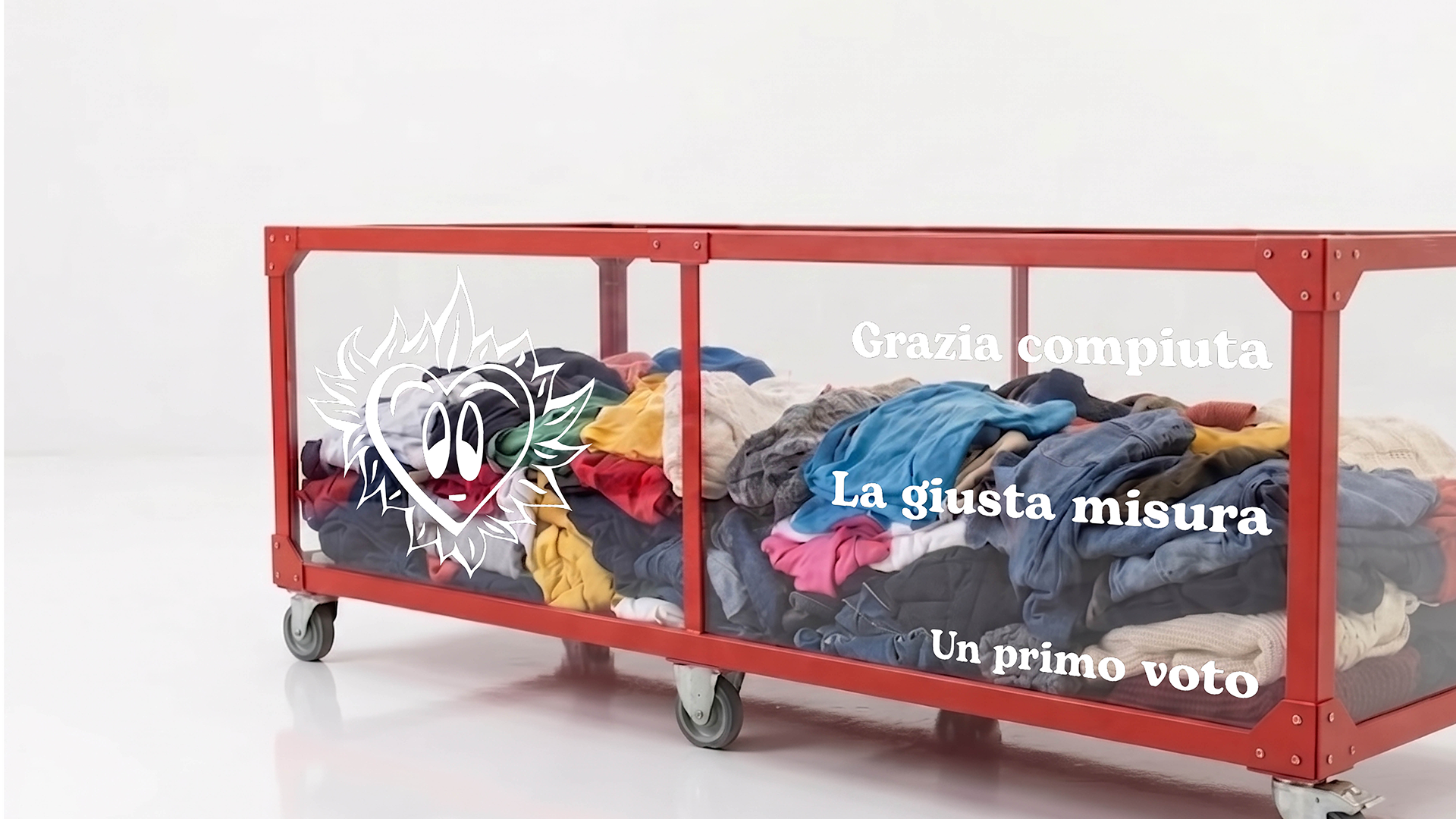
The brand experience crosses the boundaries of interior architecture to project itself into the urban and material dimension of the Borgo Rovereto neighborhood. The connection between the shop and the nearby Neighborhood House is traced by a flooring wayfinding system composed of red ceramic tiles embedded along the sidewalks. This visual fil rouge, deliberately devoid of rigid directional elements or invasive logos, suggests an osmotic and pedestrian continuity between the two social outposts. The used clothing drop-off phase is redesigned through transparent plexiglass collection bins that act as awareness devices, showing the accumulation of donated clothes through three symbolic thresholds marking the transition from the first vow to the right measure, up to the achievement of fulfilled grace.